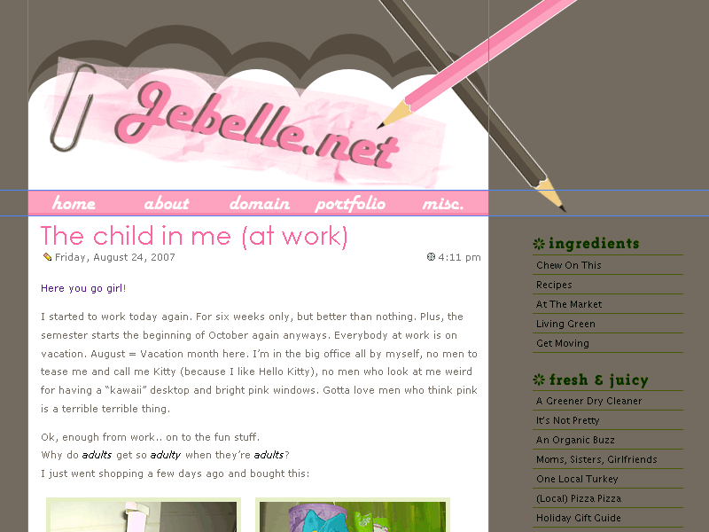
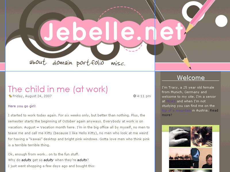
As you can see (I hope), I’ve created a new layout. It’s my first with a big footer 🙂 I hope you like it, if something is “irky”, please let me know.
It works pretty much in every browser, just not IE 5.
At first I was aiming to a layout like on chanelwood.com
I thought it was ok, a little too plain (I always try to create plain layouts, but it never happens – I always have to add… more!)
Then I noticed that Regina had quite the same header (not just a rectangle – but with the nice curve in it) so I decided to take it down again – she had her layout up first, I complimented her on how nice it is and I thought it would be a little strange to come up with the same style a few days later, ehem 🙂
So – Layout #2 was created
I didn’t like it – the header looks like it has blood drops (imo)
After a day of frustration I changed the whole style completely
Mm yeah, that’s what I mean when I say “I always try to create plain layouts, but it never happens – I always have to add… more!”.
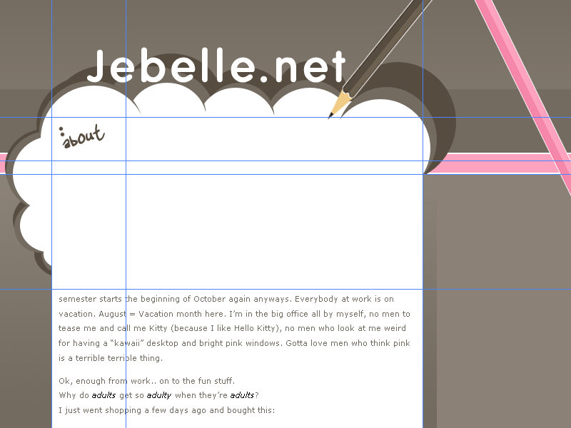
At last I created a layout with no header, just this white box – which, of course, then was too plain for me. And now I have this header you’re seeing. A pencil with ink-drops. A pencil doesn’t use ink, I know, but they are so pretty 🙂
Please excuse, the links are working but the pages are messed up (remember I used this green box for every different topic) so I need to get rid of the classes.
I’m so happy – I edited a php code 😀
I got the basic code for “Keeping Navigation Current with PHP” from alistapart.com/articles/keepingcurrent and I created an “if else” code out of it (not only an “if”). I’m happy it actually worked.
—————-
Now playing: Robbie Williams – Beyond The Sea – Finding Nemo


Oh I love it. I sent you an email about it.
➡
Looks very pretty 🙂 But the navigation is acting little oddly… o_O
[quote comment=”10814″]Looks very pretty 🙂 But the navigation is acting little oddly… o_O[/quote]
That’s because I’m editing it 😛 (changing it)
Very pretty! I’m having some problems with the navigation though — do you want a screenshot? 🙂
[quote comment=”10816″]Very pretty! I’m having some problems with the navigation though — do you want a screenshot? :)[/quote]
Yes please
It’s fine now, the problem must have been fixed. Or it was a random one with my browser — the misc tab had a large gap beneath it. 🙂
[quote comment=”10818″]It’s fine now, the problem must have been fixed. Or it was a random one with my browser — the misc tab had a large gap beneath it. :)[/quote]
Ok. I’ve been working on the navigation the last few minutes and changed it around a bit 😆
Wow, this is fricking adorable! I love the colors and the way you put eveyrthing together. And that big footer looks just great, I’ve seen big footers that aren’t very pretty, but yours is definitely looking great 🙂
Great job!
i really like it! big footers are so hip and cool 😀
i absolutely love this layout!
and i love big footers 😉
My goodness you went through a lot of designs. I totally understand what that’s like – sometimes it’s the actual process of settling on a final design that’s “just right” that can often be the hardest.
I love the one you finally settled on though – It’s so cute! The header and the footer especially are my favorites. Very lovely – great job. 🙂
Oh that’s really cute. I can’t help but feel that there should be a larger site title somewhere near the top of the page, incorporated into the image (and not just in the navigation). It’s awesome cute though!
Das gefällt mir wirklich sehr gut! *_*
Vor allem die Farben passen fantastisch zusammen…
Darf ich dich fragen mit welchem Programm du arbeitest? Denn in deinen Screenshots sind so komische blaue Linien *g*
Wow! A new layout! What a surprise. 🙂 Looks so soft and feminine. I really like the look of the footer.
You know, a few days ago I stumbled on your site and I feel in love with the (previous) layout. I even started writing a blog post on my fave website layouts and yours was going to be featured. Of course I am lazy and never got around to publishing the post.
Today I decided to write some more, so I came onto your site to take a screencap and then I blinked twice, thinking um am I at the wrong address…haha
But I must tell you, I absolutely love this layout, especially the pencils above each comment.
I guess I better finish that post (don’t count on it for a few days) with your new layout being featured.
Although this layout is gorgeous and stylish, I still prefer the other (brighter colours FTW) one. Great job.
Oh the joy of creating a new layout. It happens to me also. But it turned out nice anyways right? right. If anyone has IE5..it’s time for them to update. haha. Anyways, I was hoping if you would like to do a link exchange. That would be awesome 😀
Im a big fan of your layouts, srsly. Ive started reading PHP for Dummies and you and your layouts have been on my mind since. It’s my goal to be able to code a PHP layout from scratch, or at least drastically change how a theme looks like.
I love the new look! 💡
I really like the new layout. The little flickr photo section is neat.
When I was here the day you posted this, I did not see a new layout. Now I do! I love it. Wonderful!
Lovely, there’s no other way to put it. I did like the first version as well, but you’re right it resembles Regina’s layout too much. Plus, this one is more eye-catching with the two pencils.
There’s only one thing I’m wondering about… where’s the site title?
Oops I’m late. This looks so amazing! I love the colour scheme and the layout is just so cute!