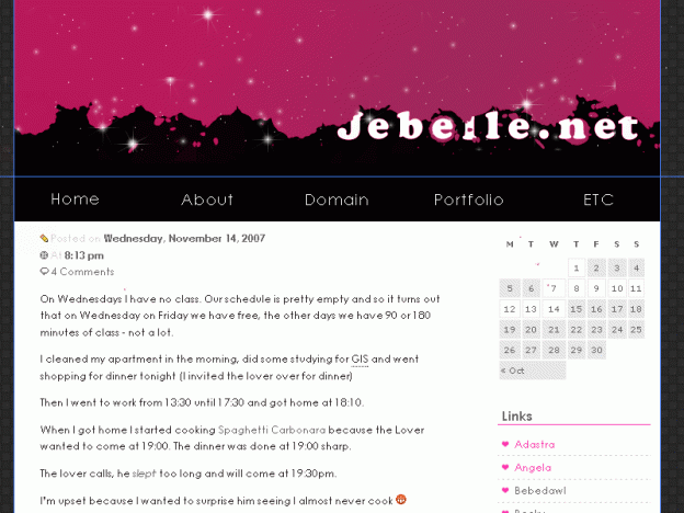
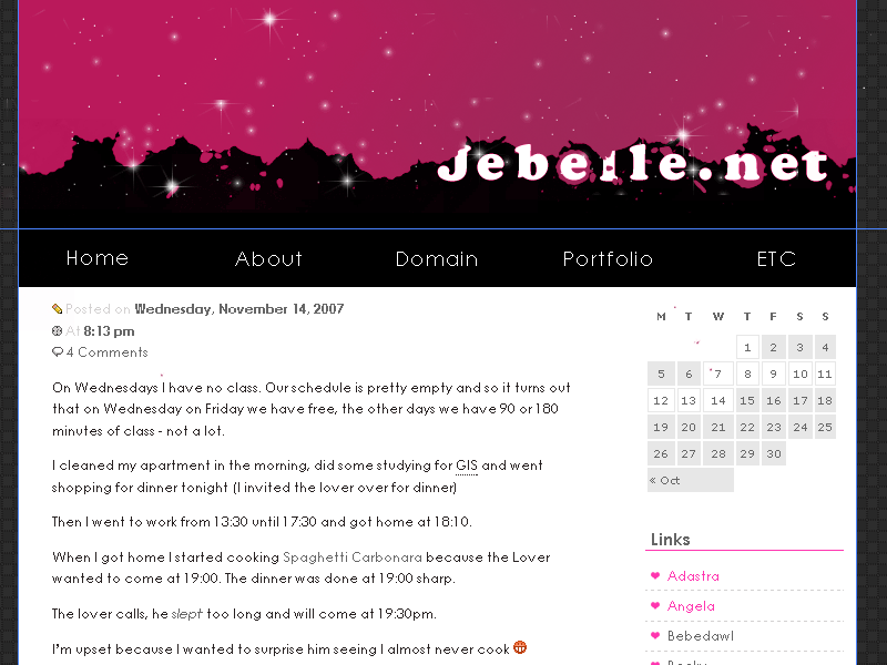
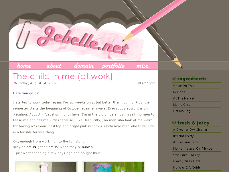
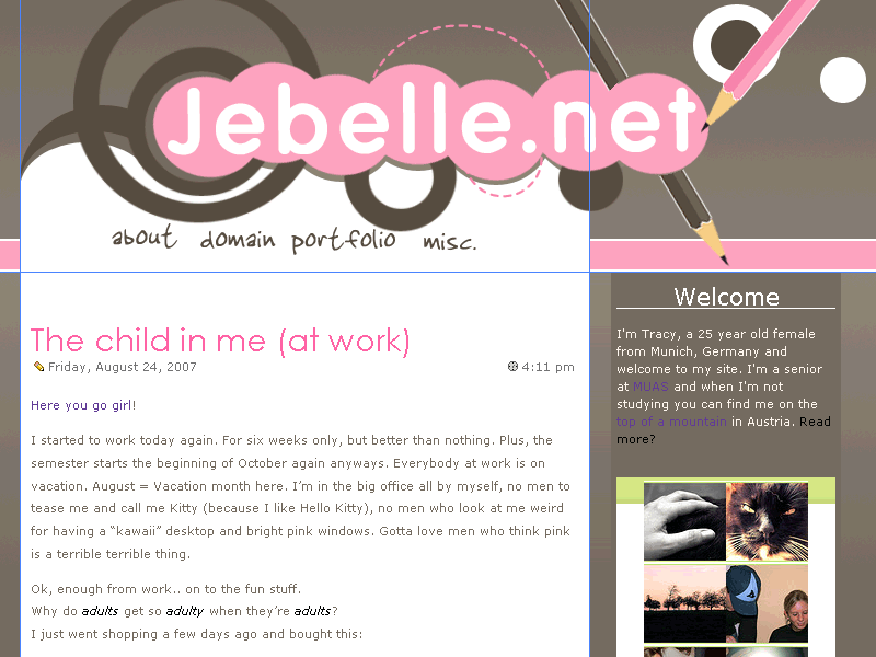
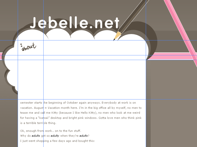
As you can see (I hope), I’ve created a new layout. It’s my first with a big footer 🙂 I hope you like it, if something is “irky”, please let me know.
It works pretty much in every browser, just not IE 5.
At first I was aiming to a layout like on chanelwood.com
I thought it was ok, a little too plain (I always try to create plain layouts, but it never happens – I always have to add… more!)
Then I noticed that Regina had quite the same header (not just a rectangle – but with the nice curve in it) so I decided to take it down again – she had her layout up first, I complimented her on how nice it is and I thought it would be a little strange to come up with the same style a few days later, ehem 🙂
So – Layout #2 was created
I didn’t like it – the header looks like it has blood drops (imo)
After a day of frustration I changed the whole style completely
Mm yeah, that’s what I mean when I say “I always try to create plain layouts, but it never happens – I always have to add… more!”.
At last I created a layout with no header, just this white box – which, of course, then was too plain for me. And now I have this header you’re seeing. A pencil with ink-drops. A pencil doesn’t use ink, I know, but they are so pretty 🙂
Please excuse, the links are working but the pages are messed up (remember I used this green box for every different topic) so I need to get rid of the classes.
I’m so happy – I edited a php code 😀
I got the basic code for “Keeping Navigation Current with PHP” from alistapart.com/articles/keepingcurrent and I created an “if else” code out of it (not only an “if”). I’m happy it actually worked.
—————-
Now playing: Robbie Williams – Beyond The Sea – Finding Nemo
