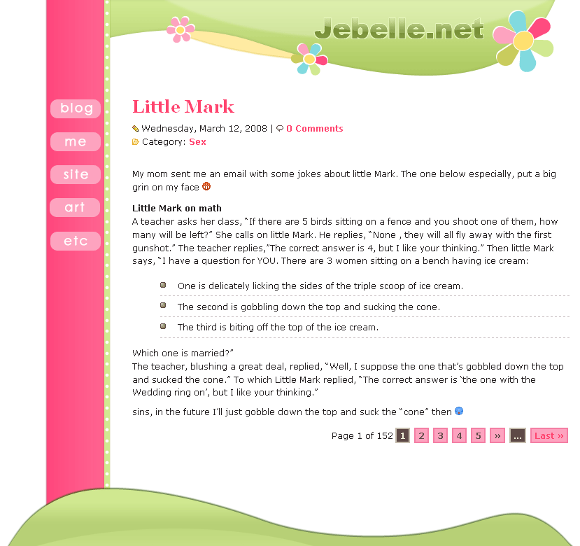
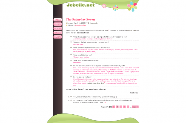
How do I create a nice-looking, spring-looking, colorful and cute layout without it looking too girly/kidly (is that even a word)?
Any ideas?
 The brown bar to the left was pink at first (see the second image), which made the layout look like a kids-layout even more. I read through some tutorials on how to create the web 2.0 look and that’s what I tried in the green wavy forms and the title.
Are the navigation buttons too close to each other?
Note that the layout isn’t even 1/3 done. The whole footer is missing and so much more. The title was in the green wavy form at first, I thought that looked better.
Any ideas on how I can spice it up a bit though?


I don’t like the font you used for your site name. I would change that and maybe make it a blue color to match the blue in flowers, since the top bar thing is already green.
I liked it before better 🙁 I think you should have just kept it; it’s hard to have cute little flowers without looking girly! You could try just changing the pink bar to brown, but I really loved the header in the old one.
@ Kaylee Oh no 🙁
@ Britney Thanks for the input!
Are you going to have that over a white background, just like in the screenshots? Well, I’ll just base on how it looks in the screenshot. I like better the one with the pink sidebar better than the brown sidebar, it looks much more girly 🙂 Also, I think that it would look nice if you enclosed that design to a template like you have now: darker background (like in this one) and the white area (along with the navigation column) centered. It would work without the dark background too, if you properly balance the side column with something at the bottom, but I’m sure you know that 🙂
Well, good luck with the new design, it looks good so far!
I agree with Lene. I also like the one with the pink sidebar better. I’ve had many people tell me my colorful layouts are childish and that I must be immature, etc. 😛 I could personally care less what they think. I like girly and colorful. I’m sure whatever you come up with will be lovely. 😀
I think the first screenshot looks very nice. I love layouts with lots of space.
Hmm, I think I’d like it better if it was inside a white box on a grey page, like your current layout. 🙂 I think that would work really well, actually – a layout with the same basic setup as this one, but with a wavy, flowery header.
The way it is now, the navigation sidebar looks slightly out of place.
I like the pink one better, but I’d add some blue there. I agree with Britney about the font. It doesn’t match the overall look of the layout at all.
You could also combine the green with dark brown as first, and have a brown/dark brown background instead. I think that combination is really fresh and spring-ly, like the woods.
Good luck 🙂
It is impossible to make a layout that has pink not look girly. 😛
But, as much as I dislike pink, I love your second layout! I don’t see anything wrong with a girly layout once in a while ^^
At a logo or something through illustrator (I’ve always loved Jacky’s @ Dubious.nu). Adds a splash of maturity amidst the quirky colours and flowers.
It’s so cute! The flowers really give off spring vibes. I like the one version with the pink sidebar the most.
I think the flowers and pink makes a layout look really “girly and kiddish.”
For a spring layout, why don’t you use greens, oranges and yellows instead of pink? Blues are nice too. I don’t blame you though.. I always have to sneak in a bit of pink in all my layouts!
Not even a third done and it’s so amazing already! I like both of them. They give off different feelings. You should make interchangeable themes! 😀
I like the second version better, but I’d have the vertical bar wider. Oh and… maybe have some sort of “drop down” kind of menu, where the submenu will be shown right below the selected category. That way it won’t seem like you’re wasting space.
Other than that, I really like the new layout. Your layouts never seem too girlie to me. So unless you decide to make use of some glitters, and clashing colors I’ll be find with anything 😛
I like the pink sidebar better, bb, but give the buttons a glass effect like what you did in the one with the brown sidebar. And schatzi.me is unanti-aliased! I don’t like the font, too 🙁 Mebbe Myriad Pro or something with a curl or curve?
Btw, my host gave me an extra 500mb until I can make the payment to upgrade my package tomorrow. This sucks. Sudden spike of traffic mid-month 🙁 I’ve gone over 2gb of BW before, but damnit, my BW limit then was 6gb.
I like the version with the pink sidebar 😉 I don’t think it looks too girly, but I also don’t really know how to make it look more like spring… Maybe add some pink-blossoming trees or something? 😉
I think it’s cute, but then again, I tend to be attracted to girly/kids layouts anyway!
It’s cute:-) How is the background going to be? I suggest a green similar to the header. If you keep the background white, there will be a little “too much space” (don’t know how to explain it:-) Maybe you could add some pink border to the brown bar?
Aw, I don’t mind girly and childish layouts at all, as long as they’re cute. I think I like the pink sidebar better too.
I like the one with the black background sidebar. 🙂
I can’t wait to see how it finishes; I like the pink sidebar more than the brown — it seems more in keeping with the theme. I’m not sure on the font for the title either. The rest of it is lovely (and I love seeing in-progress designs). 🙂
Oooh, Tracy, it looks great so far! I’m with most of the others, I like the pink sidebar better…although it may be because of that extra green stripe. Maybe the dark one would look better with the green stripe too?
I’ve been looking at the navigation…I really like how your current layout has curvy-boxed titles (like recent posts and recent comments below) that sort of “flow in” to the other elements. Maybe if the navigation link backgrounds stretched a bit beyond the sidebar it would add some more “spice”?
I’d have to see it though! 😀 Good luck on this layout, I know it will look awesome!